From Legacy to Modular: The Evolution of Ford’s Finance Calculator
- sairajayne5
- Aug 13
- 7 min read

Updated: Aug 14

This Finance Calculator case study follows the journey of transforming Ford’s decade-old tool into a modern, modular experience that works seamlessly across markets and contexts. From competitor analysis to accessibility reviews, I designed solutions that balanced legal, technical, and user needs—without sacrificing clarity or trust. The result is a future-ready calculator that’s flexible, scalable, and built to support evolving customer journeys.
Contents
Contributions
Contributors
Project Background
2023: Setting the Scene
2023: Understanding the Problem
2023: Redesigning the Finance Calculator
2023: Interim Calculator Designs
2025: Building a Future Ready Calculator
2025: Redefining the Calculator
2025: Design Approach
2025: First Focus: Pricing Stack
Next Steps
Contributions
2023 - Benchmarking and competitor analysis, Heuristic teardowns, design system support, aligning a fragmented calculator and created intermediate UI designs
2025 - Prototyping UX solutions, research and analysis.
Contributors
2023
Working with Oliver UX and UI designers to create the new calculator.
Working with internal development teams and external development teams from Deloitte.
2025
Working with internal teams, VML and Ford Credit to provide research for UX decisions.
Project Background
The finance calculator on Ford.xx had been around for nearly a decade—originally a simple tool designed to provide representative finance quotes through a basic backend. As the business evolved, so did the calculator, eventually integrating with Ford Credit’s API to offer real-time quotes. But while the backend advanced, the user experience didn’t follow suit. Different teams across the organisation had built their own versions of the calculator to meet specific needs, resulting in a fragmented experience with inconsistent logic, design, and functionality.
By 2022, it was clear a unified approach was needed. The newly formed FinTech team set out to bring these calculators together under one system—introducing new banking integrations and aligning the experience with the upcoming 2023 redesign of the Ford website. I partnered with the design agency Oliver to ensure the design system included the right components for a more scalable, user-focused calculator. With tight deadlines and limited resources, I also delivered interim designs that could be implemented quickly, bridging the gap between short-term delivery and long-term vision, while minimising rework.
In 2025, I am leading a complete UX redesign of the calculator from the ground up. The focus: to build a modular, future-proof solution, flexible enough to adapt to different user journeys, responsive across devices, and scalable for use across both Ford’s website and dealer systems.

2023 – Setting the Scene
When I first joined the project, the Ford Finance Calculator was showing its age. It had started life as a simple backend tool a decade earlier, but after years of patchwork updates from multiple teams, it had become a fragmented, inconsistent experience.
I was tasked with improving the calculator while working within tight development timelines, legal constraints across 23 countries, and limited user access for research.
My immediate goal: bring the tool in line with Ford’s new design system and brand guidelines, while ensuring the components could flex to handle edge cases and be reused across the wider site.
Understanding the Problems
With little time and limited direct user access, I used a mix of research methods to quickly surface the most critical issues.
Heuristic Evaluation I reviewed the legacy calculator against established usability principles. The results were clear - inconsistent visual hierarchy, clashing components, inaccessible colour use, and a dated visual style that hurt usability.
Stakeholder Interviews Speaking with product, legal, and business teams revealed a recurring theme: the calculator had become a “make do and mend” project with no clear vision for its future.
Competitive Analysis I studied 20+ competitor calculators from automotive and fintech brands. Almost all embraced simplified layouts, restrained colour palettes, clear language, and engaging input fields - all missing from Ford’s offering.

Key Insight: The calculator wasn’t just outdated - it was actively making the finance journey harder for users. It needed to be simpler, more guided, and more accessible.
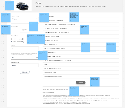
Redesigning the Finance Calculator
With the problems identified, my first task was to turn them into actionable direction. I translated the research findings into detailed business and functional requirements, ensuring they addressed:
Accessibility (colour contrast, component semantics, screen reader support)
Legal compliance across 23 markets
Technical feasibility and integration with Ford Credit’s API
Component flexibility and reuse for other journeys
I worked closely with the design agency Oliver, providing requirements and reviewing their low-fidelity wireframes. These early layouts explored different flows, input arrangements, and hierarchy patterns - helping us visualise how a cleaner, more guided experience could work.

Once the UX was confirmed, we moved on to the UI, ensuring components were flexible enough to handle edge cases, clearly expressed Ford’s updated brand guidelines, and could be reused across the rest of the website.
This resulted in a functional, accessible, and attractive set of designs - but it also made one thing clear: the development teams would not be able to deliver them in time for launch.

Interim Calculator Designs
With the full redesign pushed beyond the initial release, I took the lead on delivering an interim solution that improved the experience without derailing timelines.
I proposed two practical options, each with trade-offs:
“Feel” First
Pros:
Quickest to implement - minimal development changes.
Improved task flow and hierarchy, making the calculator easier to use immediately.
Laid groundwork for future restyling with minimal rework.
Cons:
Visual inconsistency with other parts of the site until the redesign was complete.
Required a second development cycle to apply the visual overhaul later.

“Look” First
Pros:
Delivered full brand alignment immediately - colour palette, typography, and component styling matched the rest of Ford’s ecosystem.
No obvious visual disconnect for users moving between tools.
Cons:
Did not fix layout or flow problems, meaning usability issues persisted.
Risked delaying future layout improvements due to “looks fine” perception from stakeholders.

By presenting both routes with clear pros and cons, stakeholders were able to make an informed choice. The chosen “Feel First” approach allowed us to follow quickly with the visual update later. This meant the additional work had minimal impact on the year’s roadmap and was delayed just long enough to share some component development with other teams - further shortening overall development time.
2025 – Building a Future Ready Calculator
Two years later, the challenge was no longer just about modernising the Ford Finance Calculator - it was about future-proofing it. The business wanted a modular, versatile tool that could adapt to different audiences, markets, and contexts without requiring full redesigns each time.
Unlike 2023, this phase began with a clear strategic vision: break the calculator down into independent, reusable components that could be deployed wherever they were needed across Ford’s digital ecosystem.
Stakeholders had specific ideas:
Checkout teams wanted to implement pricing stacks without opening the full calculator
Dealer systems needed the ability to add complex input fields to generate quotes without requiring full cost breakdowns.
Inventory pages asked for a compact Pricing Stack to display on individual vehicle cards.
I also used figma to tokenise the previous designs to again future proof the designs from future changes

Redefining the calculator
This time I had more access to both users and stakeholders, which allowed for a more collaborative approach to uncovering needs and opportunities.
Accessibility Reviews With Ford committing to WCAG compliance by June 2025, I audited the current calculator with the fintech team, identifying both major and subtle accessibility issues:
Incorrect font weights and styles reducing readability.
Hover states on tabs missing clear focus indicators.
Misused colours breaking contrast rules.
These reviews weren’t just about ticking compliance boxes — they became a chance to refine interaction design and improve overall clarity.
Stakeholder Interviews Conversations revealed an important shift: the calculator was no longer seen as a single-page tool, but as a set of building blocks that could appear anywhere in the customer journey. The biggest ask was flexibility - the ability to deploy just the relevant component without carrying the whole calculator along with it.
Competitive Analysis I revisited over 20 calculators from automotive and fintech brands to see what had changed since 2023. The answer: not much. The industry was still favouring clean, stripped-back designs - and few competitors were offering modularity or tailored flows for business customers. This confirmed Ford’s direction as a point of differentiation.

Key Insights Shaping the Redesign
Internal stakeholders wanted a modular architecture for maximum utility across journeys.
Designs needed room to grow - so future features like EV fuel savings or service plan integration could be added without overhauling layouts.
The design system had matured, giving more tools to create engaging, consistent experiences without heavy custom styling.
Design Approach
Using the research findings, I began mapping out the calculator into distinct modular sections:
Pricing Stack – to display cost breakdowns in checkout flows, inventory listings, and the full calculator.
Input Fields – scalable to support anything from a few key fields to a full application flow.
Vehicle Details - Exploring the API data that is provided to the finance calculator to using it to provide context to the calculator.
Future-proofing was baked in early. For example, the overlay component would have a “configuration mode” so new features could be slotted in without disrupting the main build.
First Focus: Pricing Stack
I began prototyping the Pricing Stack module first, as it was the first scheduled for development inside the checkout journey.
On desktop, it needed to work horizontally, allowing multiple stacks to be compared side-by-side.
On mobile, it needed to collapse into a vertical format without losing clarity.
While tabular by nature, it still had to feel engaging and approachable - not like a spreadsheet.
These prototypes balanced data density with readability, ensuring users had enough information to make financial decisions while keeping the interface friendly and branded.
Next Steps
Complete redesign for input fields to be able to include any number of complex fields or simple fields for implementation in dealer systems and the finance calculator
Complete redesign of the Vehicle Details module to provide users with essential context about the calculator, while avoiding information overload.
Merge all modules into the unified calculator framework
Implement Configuration Mode to simplify future updates and customisations.


Comments