Designing for confidence and flexibility - 1Streetworks
Project Structure
Project Background
Setting the Scene
Understanding the Users
01 — Helping users understand the auto-draft
02 — Designing signage that could scale
03 — Creating consistency as the product grew
Looking Ahead
Reflections
Project Background

1Streetworks is a browser-based traffic management planning application (TMPA) that helps users plan the traffic management required to carry out roadworks and create traffic management plans as part of the wider permitting process submitted to local councils and authorities.
Traffic management planning is a specialist process. Planners need to understand the road, the works being carried out, the available space and the safety of pedestrians and other road users. These decisions are guided by industry standards, including the “Safety at Street Works and Road Works: A Code of Practice”, commonly referred to as “The Red Book”.
1Streetworks brings much of the planning process into a single map-based environment. Users can search for a location and build a traffic management plan from scratch, edit an existing plan, or use auto-draft to generate a starting point automatically.
Auto-draft is one of the more distinctive parts of the application. The user defines the works area and provides information the application can't determine itself, while 1Streetworks combines this with geographic and spatial data about the location. A rules engine built around the Red Book then determines the minimum traffic management required and, where possible, generates the plan.
The automation is intentionally conservative. It applies the Red Book rules based on the information available to it, while an experienced traffic management professional may understand the nuances of a particular road or situation and make a different judgement. The auto-draft isn't intended to replace that expertise; it handles more straightforward scenarios while allowing specialists to take control where greater nuance is required.
Once an auto-draft is generated, it opens in the manual planning environment as a starting point rather than a finished plan. Users can review and refine it, add additional elements and create the PDFs needed for the wider permitting process. Some users may not need to take it any further if it has already given them the traffic management type, cost indication or validation they needed.
The application also supports diversion planning and can be used as a research tool. Geographic data can be layered over the map to show information such as road classifications, bus stops and previous, current or upcoming permits, helping users understand an area before planning their works.
1Streetworks therefore serves users with very different levels of experience. Some need guidance or an early indication of the likely traffic management and cost, while qualified traffic management professionals need the flexibility to build, edit and customise detailed plans themselves. Designing for both meant finding the right balance between guidance and control: making a complex process more accessible without restricting the expertise of those who already understood it.
Setting the Scene
I joined 1Streetworks as its first dedicated designer. The application was already live with paying customers and had an established visual foundation based on Material UI, but the product itself was still evolving quickly.
The original experience had been designed around auto-draft, which was initially central to how the application worked. As the product grew, new functionality was added and the way customers used 1Streetworks began to change. Auto-draft was becoming one part of a much broader planning tool, but the experience hadn't always evolved with it. Without a dedicated designer in the team, the product manager and developers had understandably focused on getting new functionality into the hands of customers, which meant features were sometimes slotted into an interface that hadn't originally been designed to accommodate them.
I was initially brought in to design upcoming features and take ownership of the overall look and feel of the application. For me, that meant more than applying a consistent visual style. I wanted to understand how the existing product worked, where users were experiencing friction and how we could create a more consistent and intuitive experience as the application continued to grow.
I started by auditing the entire application, working through it screen by screen and documenting inconsistencies, usability concerns and anything I didn't understand. I captured screenshots and questions as I went, then worked through them with the product manager and wider development team to understand why particular decisions had been made and validate which issues genuinely needed addressing.
The audit gave us a backlog of improvements that could be prioritised alongside new feature development, from small component inconsistencies to bigger questions about how users understood and navigated the product.
My role also began to move further upstream. Rather than only being given a feature and working out where it should fit, I advocated for more direct contact with customers and greater involvement in understanding the problem before deciding on the solution. Customer-facing teams could give us an initial direction, but speaking directly to users helped me understand where the real value was and explore different approaches before bringing options back to the product manager and developers to discuss, challenge and refine together.
Understanding the Users

As I was new to both the product and traffic management, speaking directly to users became an important part of how I worked. Rather than treating research as a single phase, I used it throughout the design process to understand problems, validate ideas and build context for future work.
Over 8 months, I spoke to around 12 users across 4 companies, including both existing customers and companies that had previously used 1Streetworks. Their traffic management experience varied significantly. Some were dedicated traffic management professionals who created plans every day, while others used the application less frequently or had limited traffic management knowledge.
Interviews would often begin broadly, giving users space to guide me on how they worked and where they experienced difficulties, before moving into the specific area I was investigating. This was particularly useful because users would often raise the problem I wanted to explore themselves, giving me a natural opportunity to understand it in more detail rather than leading them towards it.
I also joined customer training sessions run by the customer success team. These gave me an opportunity to hear questions and reactions as they happened and see the contexts people were actually using the product in. In one session, for example, I saw how difficult parts of the application were to use on the smaller Toughpads used by some users. It turned responsiveness from a theoretical design consideration into a very real usability problem.
Alongside direct research, I worked closely with customer success, including their traffic management expert, as well as the product manager and development team. I also facilitated workshops with the product manager, customer success, managing director and tech lead, using affinity mapping to organise what we were hearing and help the team agree which opportunities should be prioritised.
01 — Helping users understand the auto-draft
When failure doesn't explain anything
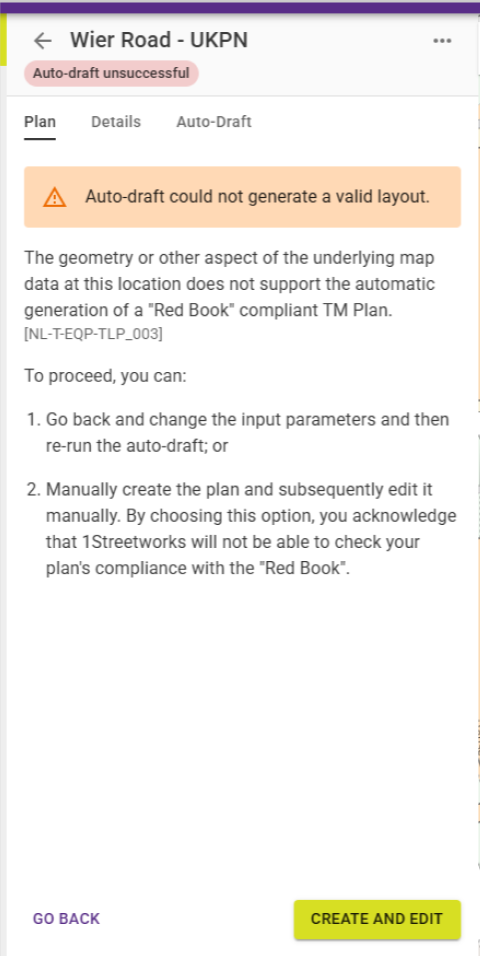
One of the first areas I focused on was what happened when the auto-draft failed. The existing message told users that the plan couldn't be generated and provided an error code, but gave little explanation of what had happened or what they should do next.
Users could look the code up in a large reference table or contact customer success, but neither was particularly useful in the moment. They were left to work out whether they had done something wrong, whether they should try again, or whether the application simply couldn't handle the scenario.
This was particularly noticeable with users from companies that had stopped using the product. They described moving or rotating their works area and repeatedly trying again until they got a result; users who were less invested were more likely to give up.
Looking beyond pass or fail
Initially, there was a view within the development team that the solution was simply to reduce the number of failures. While improving the automation was important, the auto-draft was working with complex rules, road layouts and user inputs, so there would inevitably be scenarios it couldn't resolve. If we couldn't prevent every failure, we needed to make sure users understood what had happened and what, if anything, they could do next.
Behind a single failure message was a table containing thousands of potential reasons, from being unable to place one sign to road layouts the automation hadn't yet been programmed to handle. I worked through these with the product manager and grouped the outcomes into six meaningful states across three broader categories: partial success, total failure and system errors.
A failure could still be useful
There were situations where the auto-draft had successfully determined the traffic management required but couldn't complete the entire plan. For someone using 1Streetworks to validate their assumptions or estimate cost, it may technically have failed but had already calculated the information they needed. The redesigned state surfaced that useful information instead of discarding it.
Guidance only when it helps
Whether it was worth trying again depended on where the auto-draft had failed. If it couldn't establish the works area successfully, changing its position, size or alignment could result in a different outcome. If it had progressed further and failed on something such as placing a sign, that advice wasn't necessarily relevant.
The new messages reflected that distinction: where there was something meaningful the user could try, we gave them a next step; where there wasn't, we explained the limitation rather than encouraging more trial and error.
Making failure feel less like user error

Before the changes, I regularly heard users describe unsuccessful auto-drafts as something they had done wrong: “I'm not sure what I did, but it won't work.” The redesigned messages made it clearer what had happened, what the system had managed to achieve and whether there was anything useful they could do next.
After the changes were developed, I continued to validate them through customer conversations and training sessions. It reinforced that improving the experience didn't always mean adding more functionality; sometimes it meant making what was already there easier to understand.
02 — Designing signage that could scale
Spotting the problem before it became one
When I joined 1Streetworks, signs were selected through a searchable dropdown containing around 40 options, and at that scale it worked well enough. But the signage library was about to grow to more than 100 signs.

When I questioned how users would navigate an increasingly long list, one assumption was that experienced users would know the reference codes they needed. That might work for some, but it didn't feel scalable, particularly for less experienced users who needed a way to discover what was available.
The thumbnails were also small, and many signs only differed by a number or small text change, making it difficult to confirm the right sign before placing it onto the plan.
Two ways to find the same thing
Experienced users often valued the speed of searching by name or reference code, while less experienced users relied more heavily on recognising signs visually and browsing what was available. Grouping related signs could benefit both.
Users also regularly referenced Cone, a familiar traffic management tool, so I reviewed how it organised and presented signage. I didn't want to replace an established workflow; I wanted to add another route for people who benefited from browsing visually.
Making signage easier to browse

I introduced a visual sign catalogue alongside the existing dropdown, with larger representations of the signs, search and category filters. The original search remained, so users who knew a reference code could continue working in the same way.
I also added a larger preview of the selected sign directly into the planning panel, making it easier to check the selection before placing it onto the map.

A different kind of scaling problem
The initial requirement for wicket signs was relatively simple: allow users to change whether individual lanes were open or closed. The developers had established that the sign could be generated dynamically, but I could see the same scalability problem appearing again.
A sign might contain up to six lanes, with each one showing a different type, such as an open lane, lane closure, lane narrows or contraflow. I also wanted to leave room to support hard shoulders in the future.
Creating every possible combination as a separate sign could mean hundreds or thousands of near-identical assets for users to navigate and for the team to maintain. Instead, I started exploring how the sign itself could become configurable.
Finding the right interaction
There wasn't an obvious pattern to copy, so I looked beyond traffic management at wardrobe planners, character customisation in The Sims and other configurators. I also used AI to quickly visualise different approaches.

The AI outputs weren't the solution, but they were useful for exploring possibilities and understanding what didn't work. None of the examples quite handled the flexibility I needed, so I kept exploring until I landed on a much simpler interaction.
Designing parameters, not permutations
The final approach starts with two decisions: how many lanes does the sign need, and what should each lane show?
The user selects the generic sign and chooses the number of lanes, then configures each lane individually by assigning it a type. The sign updates to reflect those choices, allowing a single configurable sign to produce a huge number of different combinations.
This became one of my favourite solutions because of how simple it feels. Once you see the interaction, it almost seems obvious: choose the number of lanes, then decide what each lane does. But I hadn't found another tool approaching the problem in quite the same way, and getting to something that simple took considerably more exploration than the final design suggests.

The interaction was deliberately compact. Screen space within the planning interface was already limited, so keeping the controls within the existing panel meant users could configure the sign alongside their plan without losing sight of the wider context.
The simplicity on the surface hides the complexity underneath. Instead of searching through hundreds of predefined signs, users make a small set of understandable choices and the application handles the combinations. New lane types could also be introduced later without redesigning the interaction.
Validating before development
At the time of writing, the parametric signage hadn't yet been released, so I couldn't measure its impact in live use. I validated the interaction with users instead; they understood how it worked and responded positively to how much easier it would make creating these signs.
03 — Creating consistency as the product grew
Small inconsistencies were adding up
One of the clearest findings from my initial audit was how much inconsistency had developed as 1Streetworks grew. Individually, many of the issues were small, but together they made the application feel less predictable.
Spacing, component sizing, alignment and button placement varied between screens. Colours didn't always have the same meaning, and established patterns such as tabs had been implemented differently in different parts of the application.
There were also multiple versions of the same components. At one point I found four different slider patterns, including sliders being used for choices with only two or three options.

Rather than redesigning everything at once, I documented the inconsistencies and worked through them gradually alongside new feature development, bringing improvements into sprints when capacity allowed.
Using the design system as a foundation
1Streetworks' design system was based on Material UI (MUI), adapted to use our own brand styles. A lot of my work involved bringing the application back into alignment with that foundation.
Not everything 1Streetworks needed existed as an out-of-the-box MUI component, so I also used it as a source of patterns and principles for more specialist interactions. The sign catalogue, for example, was bespoke but still drew on the same controls, spacing, states and behaviours.
Where I created new patterns, I added them back into our Figma design system so they could be reused rather than solved differently the next time the same problem appeared.
Designing around instinct, not against it
One of the smallest changes came from watching users interact with a back button. Although it looked like a conventional back arrow, it effectively behaved like a home button and took users out of their plan regardless of where they were in their journey.
I repeatedly saw users select it instinctively when they simply wanted to leave the mode they were working in, only to find they'd exited the plan and had to reopen it.
I changed it to behave contextually, taking users out of their current edit mode rather than out of the plan entirely. The response after release was immediate: it simply behaved the way users expected it to.
Keeping context in a complex interface
As users scrolled through long tables, headings disappeared and they could lose context. Introducing consistent sticky headers kept that context visible.

The toolbar had the opposite problem. It had grown to around 12 controls, with unavailable options often remaining visible in a disabled state. Taking inspiration from Figma, I reduced the default toolbar to around five key controls and revealed other options when they became relevant.
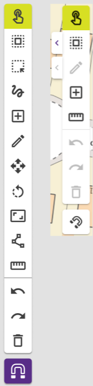
This gave more space back to the plan without removing functionality.
Consistency through collaboration
Refinement became an important part of the process. Developers would challenge how an interaction should behave: what should be selected when a component opens, what state should it remember, and what happens when the user returns to it?
Sometimes those conversations exposed something I hadn't considered; other times I needed to explain and defend why a behaviour mattered. Working through those questions together made the components more versatile and easier to reuse.
Over time, developers could reuse the same components rather than solving the same interaction differently each time, while I continued to maintain those patterns within the Figma design system.
Improving the product without reinventing it
Some changes were immediately noticed by customers after a release, while others were almost invisible. Customer success found the experience easier to explain, developers had more established patterns to build from, and improvements even began appearing in sales conversations.
For me, that was an important measure of success. I hadn't needed to reinvent the application; removing friction, making behaviours more predictable and giving the team stronger patterns to reuse meant the product could continue evolving without every new feature adding another layer of inconsistency.
Looking Ahead
1Streetworks had originally been structured around the auto-draft, but the way customers used the application had become much broader. Users could research an area, create a plan manually or through the auto-draft, edit existing plans and create diversions depending on what they needed to achieve.
As those capabilities grew, I felt there was an opportunity to give the application a clearer overall structure without forcing users through a linear journey. They needed the flexibility to move between activities while still feeling like they were working within one connected planning environment.
One area I had started exploring was a dedicated research mode. Users already used the geographic data within 1Streetworks to investigate an area, but if they wanted to capture or share what they'd found they often relied on screenshots.
I began looking at how users could save relevant findings and organise them into something shareable, using existing planning and constraints tools as inspiration. This remained an early exploration rather than a feature I took through to design and development.
There were similar opportunities elsewhere: making plans easier to organise and discover, bringing the different editing experiences closer together, and allowing capabilities such as signage to work more consistently across traffic management plans and diversions.
I would also have liked users to run multiple auto-drafts within the same plan, so they could compare different options for the same area and more easily distinguish what the auto-draft had generated from what had subsequently been changed manually.
The direction I could see emerging was less about adding more standalone features and more about connecting what was already there. The auto-draft could remain a powerful tool without needing to define the structure of the entire application, while research, manual planning, automation and diversions became more cohesive parts of the same workspace.
Reflections
1Streetworks gave me the opportunity to work in a much more research-led way and take greater ownership of my design decisions. Coming from a larger design organisation, I had more freedom to challenge assumptions, explore different approaches and take responsibility for validating the decisions I made.
Joining with very little knowledge of traffic management actually helped. I didn't have many preconceptions about how things should work, so I asked a lot of questions - including the ones that probably felt obvious to people who had worked in the industry for years. That helped me learn quickly and made me more likely to question an established way of doing something.
One of the biggest challenges was designing for two distinct experiences within the same application: less experienced users who benefited from guidance and automation, and experienced professionals who valued a specialist tool that gave them flexibility and control. Designing for one shouldn't make the experience worse for the other.
The parametric signage is probably the piece of work I'm most proud of. It was one of those rare lightbulb moments where, after exploring lots of approaches, the eventual solution felt incredibly simple. It represents what I enjoyed most about the role: getting close to a problem, understanding what people needed, challenging the initial solution and iterating until we arrived at something that worked for users, the business and the technical team.
If I had more time, the biggest thing I would improve would be how we measured the impact of changes after release. I regularly returned to users and customer-facing teams, but more structured quantitative measurement alongside that feedback would have made it easier to understand impact over time.
Ultimately, what I enjoyed most was being able to get hands-on with problems from beginning to end: understanding what users needed, challenging assumptions internally, exploring different approaches with the team and taking ideas back to users to validate and refine. It made me more comfortable questioning how something should work, while recognising that the best solution rarely comes from one person having all the answers.


Comments